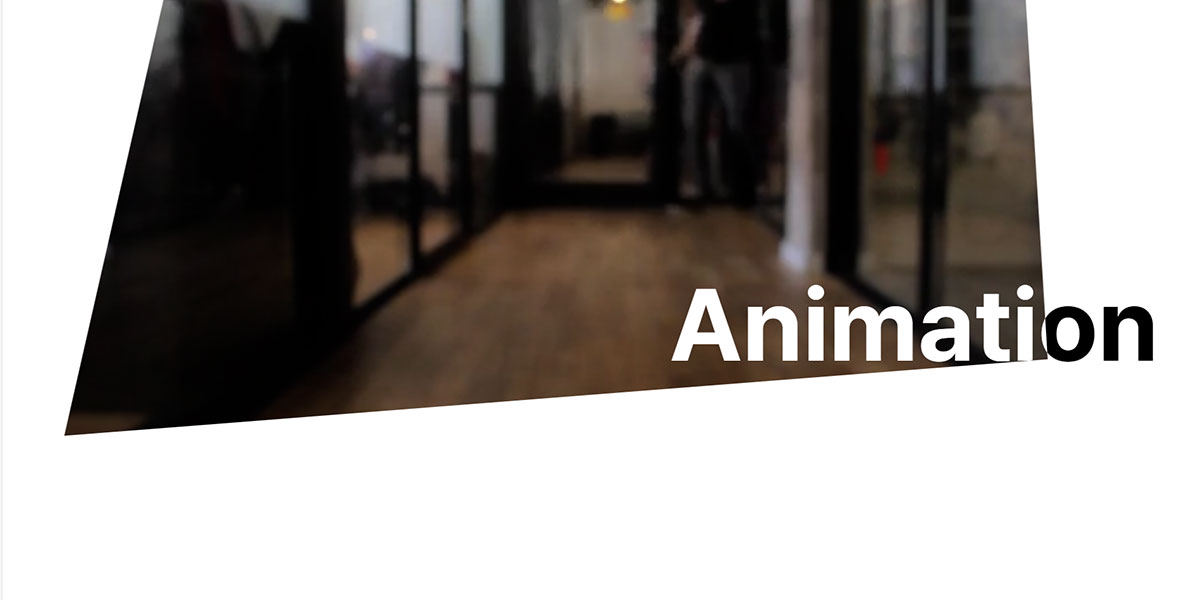
Inspired by zentry.com
Idea 1. clip-path
clip-path는 요소의 클리핑 범위를 지정하고 지정된 안쪽은 보이고 바깥쪽은 안보입니다.
비디오 배경앞에 clip-path div 를 추가한 후,
clip-path를 한번 변형하고 확대시켜 비디오 배경이 전체 보이게 만듭니다.
간단한 clip-path 도형 만들기 – https://bennettfeely.com/clippy/
.clip-container {
position: absolute;
top: 50%;
left: 50%;
width: 100vw;
height: 100vh;
transform: translate(-50%, -50%);
clip-path: polygon(0% 0%, 100% 0%, 100% 100%, 0% 100%);
}
GSAP
gsap.fromTo(
  ".clip-container",
  {
    clipPath: "polygon(50% 50%, 50% 50%, 50% 50%, 50% 50%)",
    width: "300px",
    height: "300px",
    rotation: 0
  },
  {
    clipPath: "polygon(20% 0%, 80% 0%, 100% 100%, 0% 100%)",
    width: "300px",
    height: "300px",
    rotation: 15,
    duration: 0.6,
    ease: "power2.out"
  }
);

gsap.to(".clip-container", {
  clipPath: "polygon(0% 0%, 100% 0%, 100% 100%, 0% 100%)",
  width: "100vw",
  height: "100vh",
  rotation: 0,
  duration: 0.8,
  delay: 0.6,
  ease: "power2.out"
});
회전하면서 모양을 변형하고,
이후 전체화면에 꽉차게 커지게 만듭니다.
clip-path 되어서 100% 화면에 꽉 차게되면 비디오 배경이 전부 다 보이게 됩니다.
Idea 2. GSAP Scroll Animation – Scroll Trigger
스크롤하면 모양 변하면서 작아지게 만듭니다.
gsap from to 해서 모양을 변형시킵니다.
스크롤 트리거를 걸어서 특정 위치에 오면 애니메이션이 시작되게 조정할 수 있습니다.
  scrollTrigger: {
      trigger: ".video-section",
      start: "top top",
      end: "top top-=400",
      scrub: 1,
    }
video-section top이 top에 위치하면 애니메이션 시작
clip-path 와 video background 그리고 GSAP 스크롤 애니메이션을 조합하면,
다양한 인터랙티브한 웹사이트를 만들 수 있습니다.
워드프레스로 모든 애니메이션과 디자인 구현이 가능합니다.